DAISY WHITE A2 MEDIA
THE 1975
By Daisy White
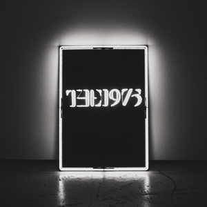
The writing of '1975' is the bangs logo, this makes it easily recognisable for fans. The fact that it is lit up, this brings the logo into the forefront is something that is continued through their albums.
The main image is their logo on a black board. This is the name of their album so obviously it is the focal point. It is situated in the dead centre on a dark background, this helps to accentuate their logo and make it stand out from most album covers. It creates a great effect as it is simplistic yet effective. The album does not give too uch away as to what the songs may be like apart from the fact dark colours are associated more with indie rock bands.
Using the colours black and white is a visual representation of the band. They are usually styled in these colours and they are the colours you would associate with that band. They make the album cover stand out because of the colour contrast. This is their house style as it is consitent through their album and their promtion posters and merchandise.

This CD's only focal feature is 'THE 1975'. This ties in with the front of the cd case, it is very simplistic yet effective.
By using a black colour, this not only ties in with the house style of the digipak, it also ties in with the Indie Rock theme.

The Album cover is very similar to the front. This is because when opened out next to eachother they have to show that they flow and are part of the same CD cover. The barcode is clearly positioned in the left hand corner, it is rather small not to defer the attention away from the CD cover. As well as this the songs are all listed on the back and iluminated much like the front. This makes them stand out but it is also still very simplistic. The vignette effect draws a lot of attention to the song lsit rather than the rest of the CD cover.